Single Codepage or Why so Many Fonts?
Really, is 16 384 symbols of two-byte Unicode not enough?
This is not a problem of quantity. There are three reasons why we use separate fonts for different groups of symbols.
- Accessibility & Fast Typesetting: most symbols could be set by keyboard, so we use only ASCII symbols. If we need more symbols we use italic, bold and bold italic ‘styles’ as fonts with different set of symbols. It’s easy: just switch Ctrl+I, Ctrl+B (Cmd+I, Cmd+B) to access new symbols.
- Compatibility: our fonts could be used in any application including old versions of Finale and Sibelius no matter wether OS is Mac or Win or any other one. For universal compatibility we use only one codepage (Mac OS Roman). No Unicode, no SMuFL. Did you try to set any SMuFL symbols in MS Word for example? ; )
- Height: we use different fonts for symbols with different height, because height (unlike width) is the same for all symbols in single font. Using various fonts with various height decides problem with leading and in most cases allows to discard font annotation files (*.fan).
Aesthetics & Legibility
Kh typefaces follow classicistic (neoclassical) aesthetics and are fine in combination with such modern serif types like Bodoni (used in our illustrations).
Kh glyphs could be characterized not as bold as contrast ones: for making large not only the shape but white space inside the shape.
All strokes which could be horizontal are bold and slanted much for making them good perceptible on staff lines. So, for ex., square notehead became a parallelogram. And its angles are extended for making it more distinct from usual notehead (so it’s not exact parallelogram). Oval, parallelogram triangle and other noteheads made with optical size compensation.
Compare:

Arrows and other additional elements made so enlarged to be legible with different staff lines thickness:
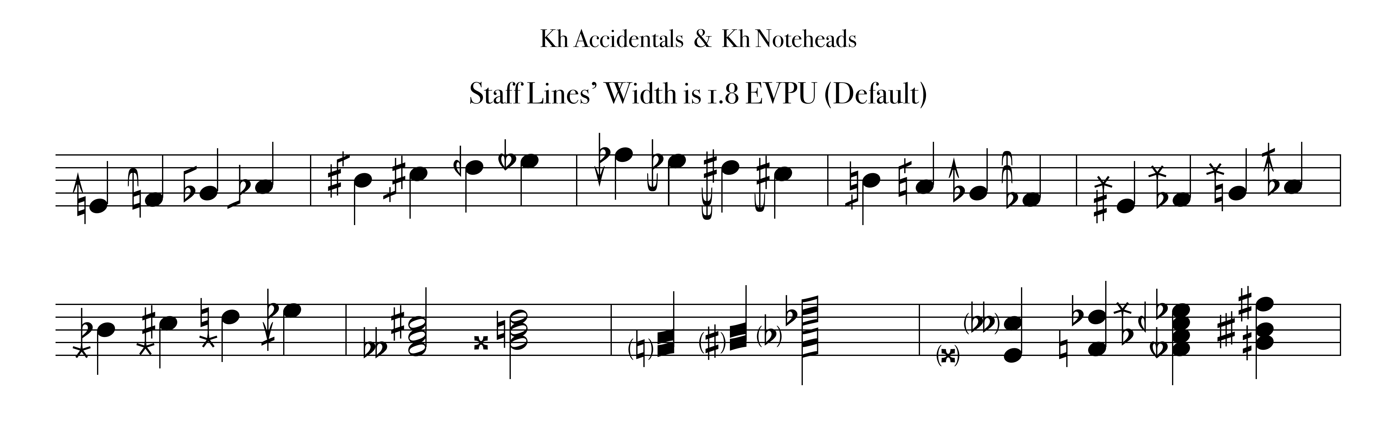
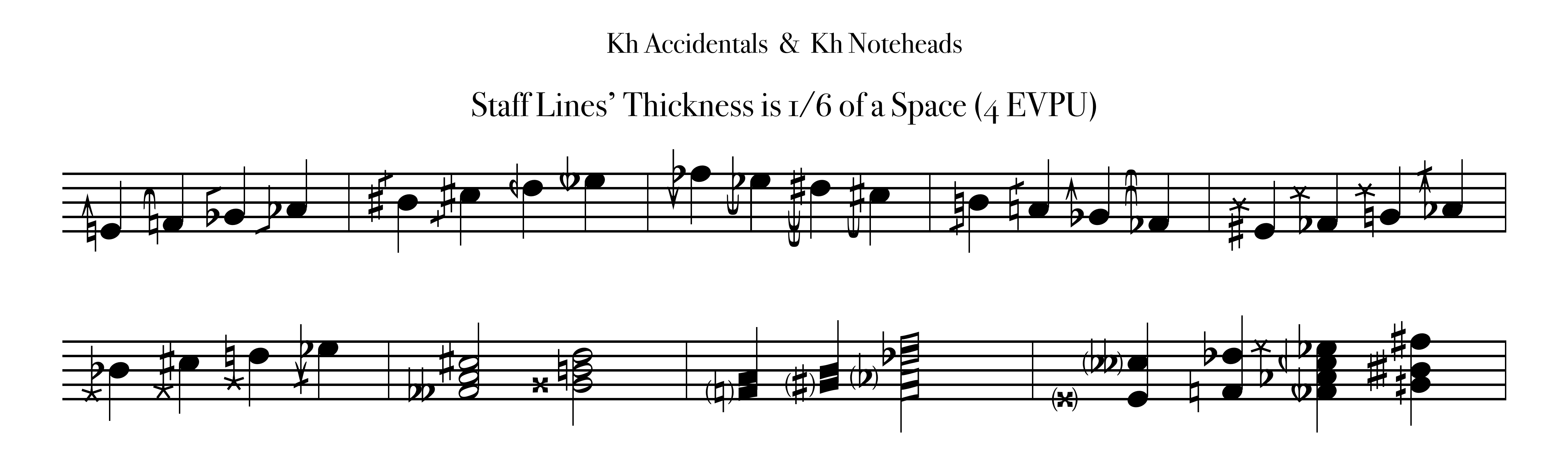
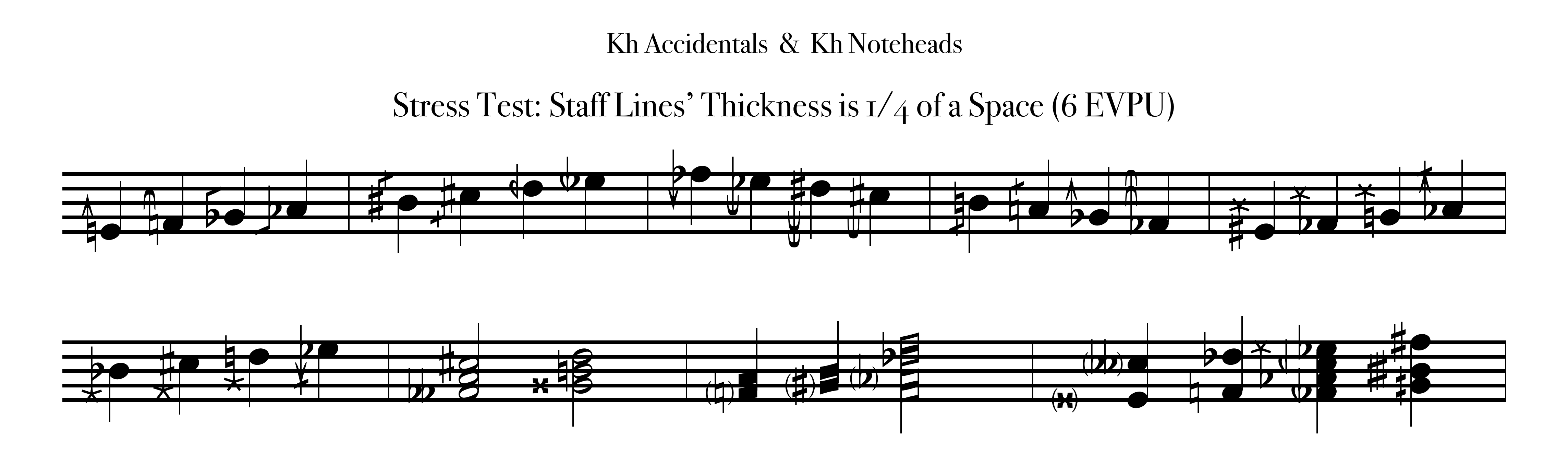
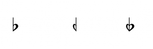
Our flat is more paunchy than in Sibelius Opus and more bold than in Finale Maestro font.
Half-flat is more narrow, so it’s really ‘half’ (and also this more tight shape of reversed flat less brakes overall glyphs’ trend from bottom-left to top-right):
Using Italic & Bold Switches
When you switch to italic or/and to bold ‘style’, you actually not to make it really italic or bold, but switch between various subsets of symbols. In Kh Woodwind Fingering Chart fonts you change (correct) symbol height:
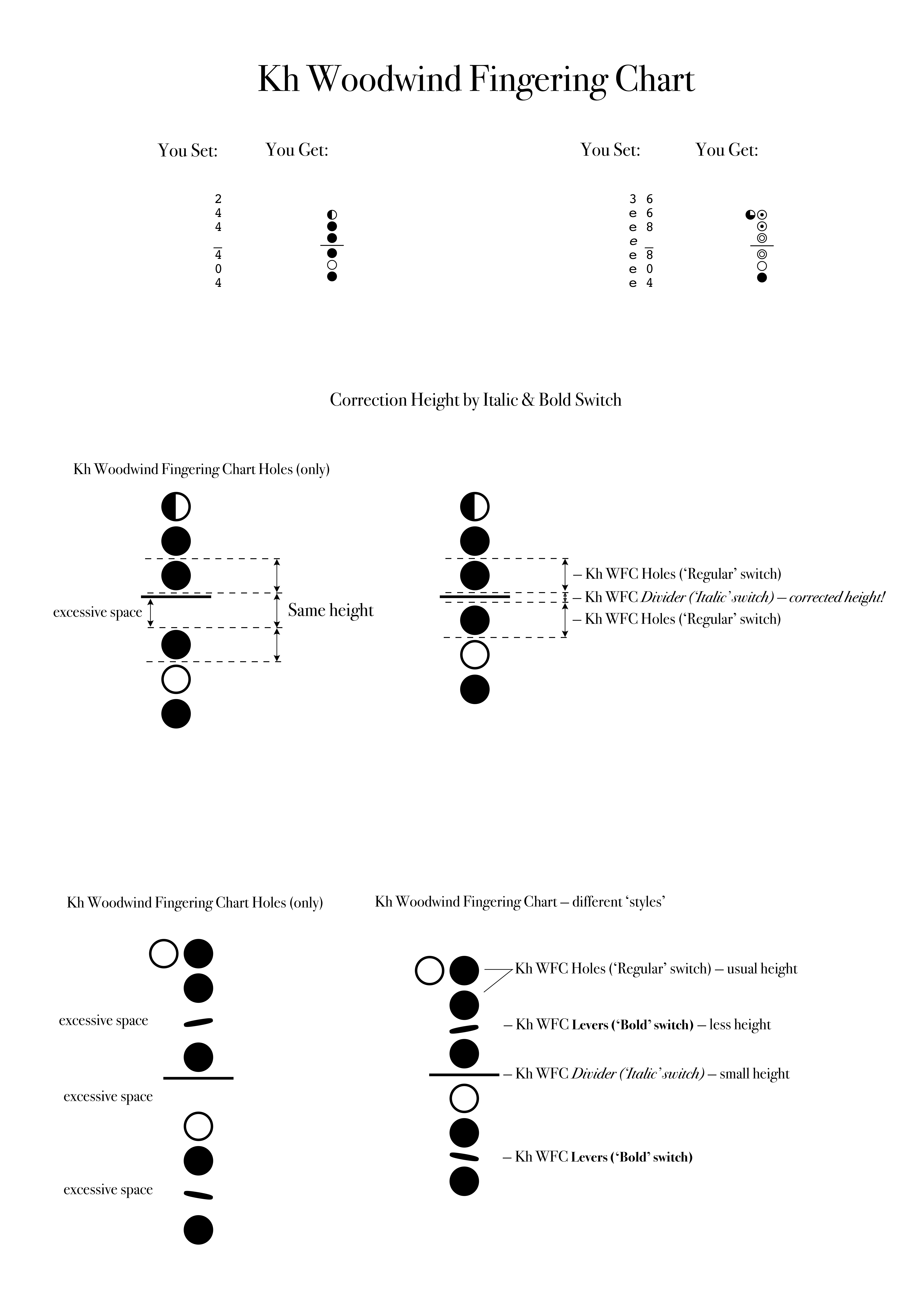
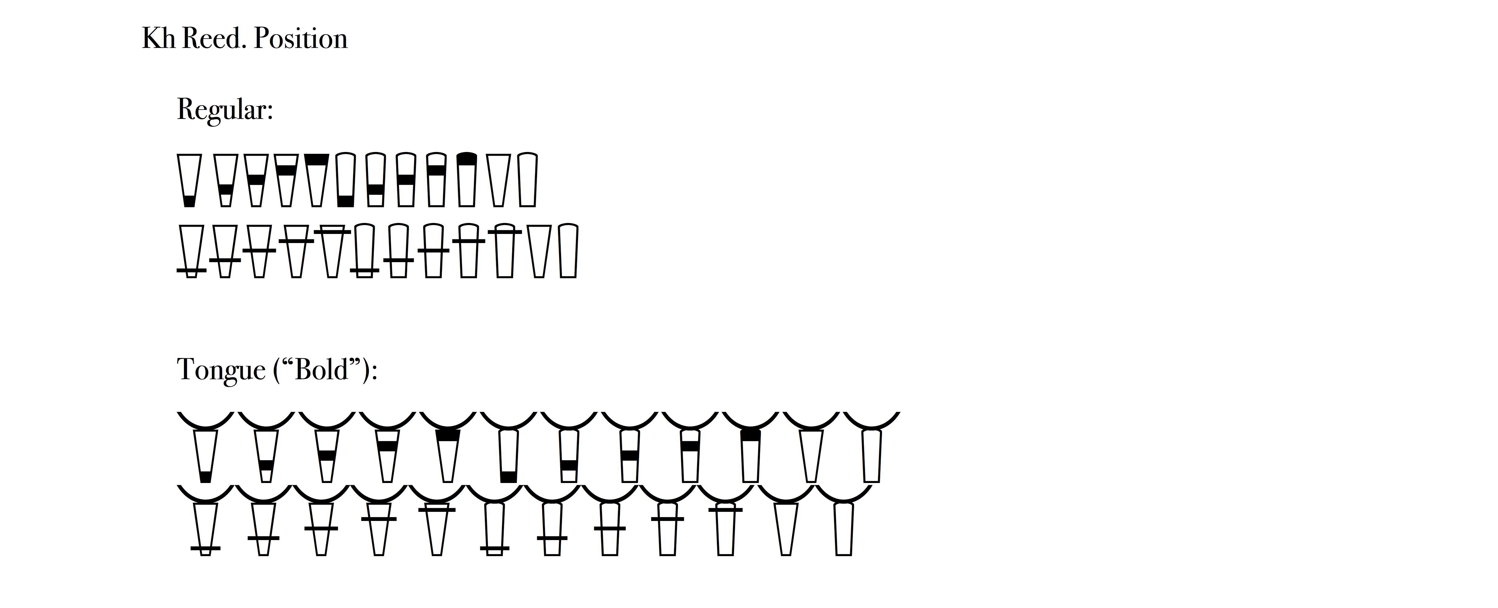
In Kh Reed. Position you switch between symbols with two kind of height:
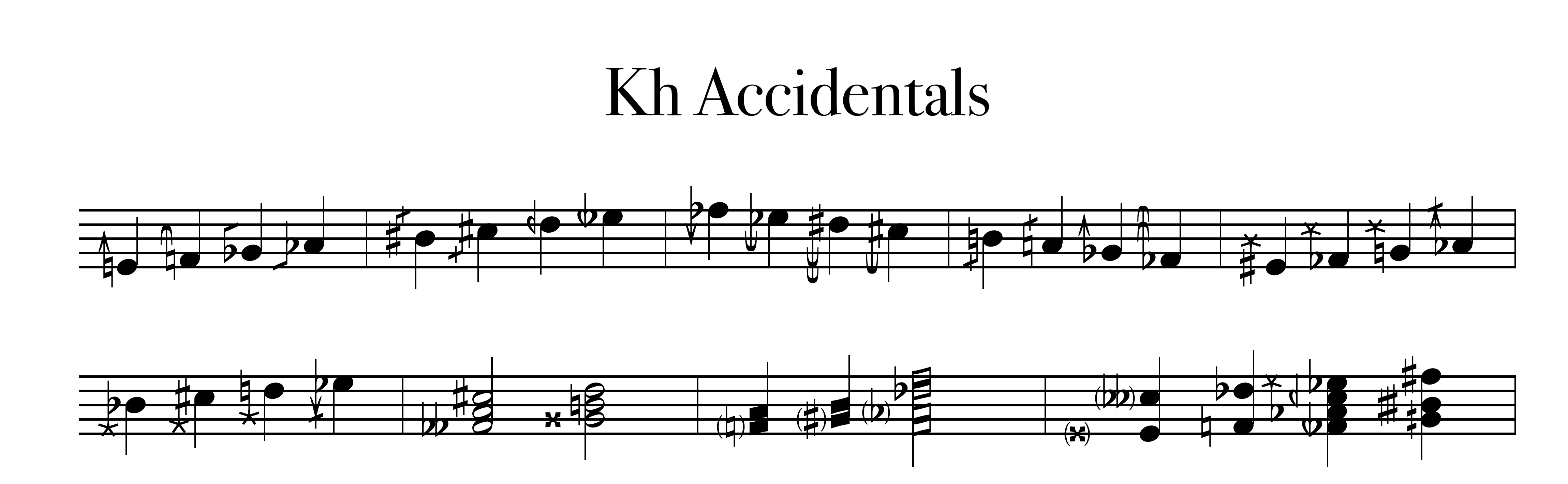
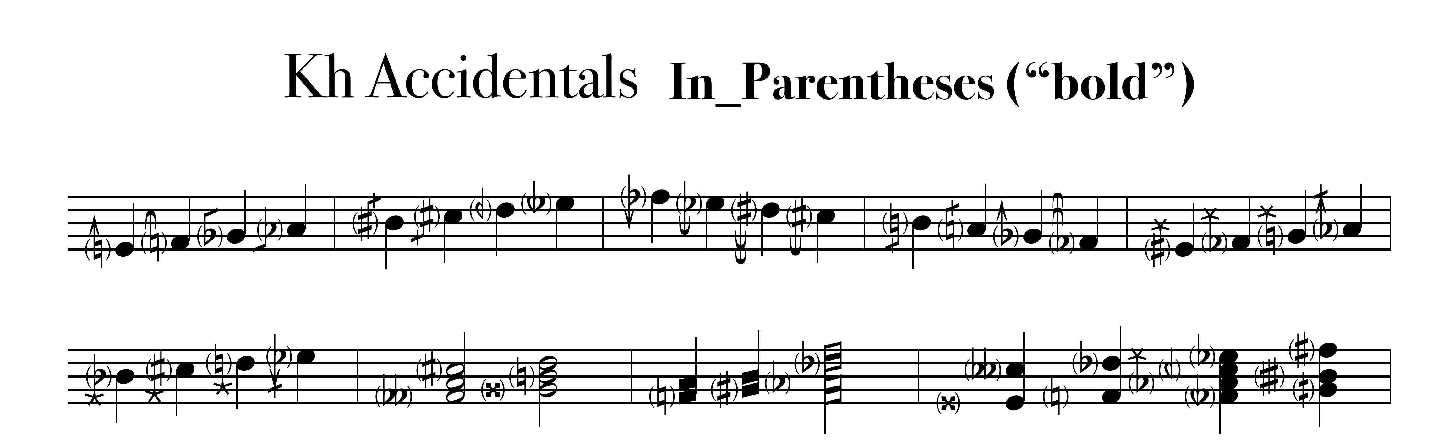
Switch Kh Accidentals to bold to add parentheses to any accidentals:
So we call them not ‘styles’ but ‘switches’.
Examples of Char Tables
The examples below are only part of the story ; )
Kh Reed. Position:

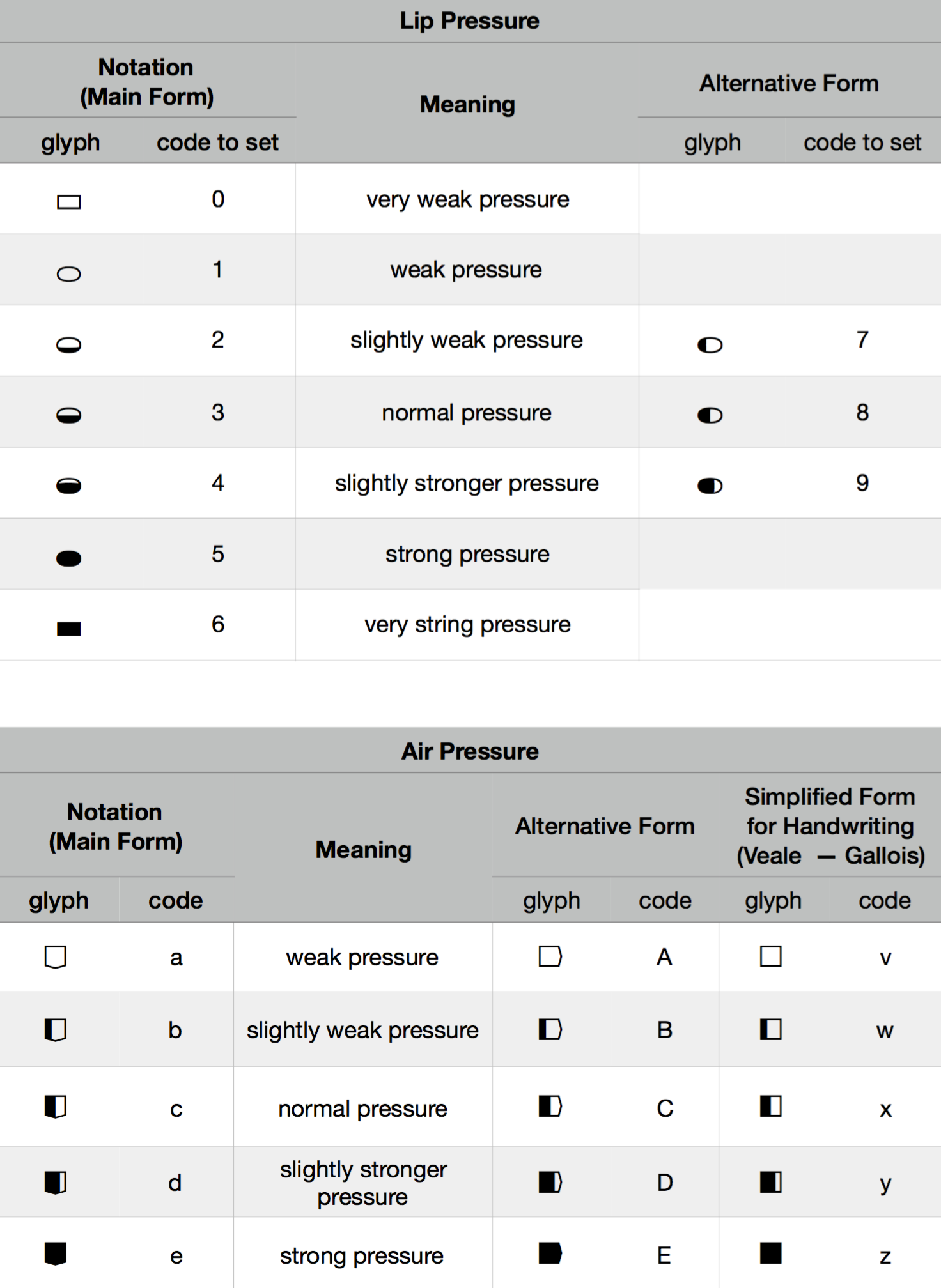
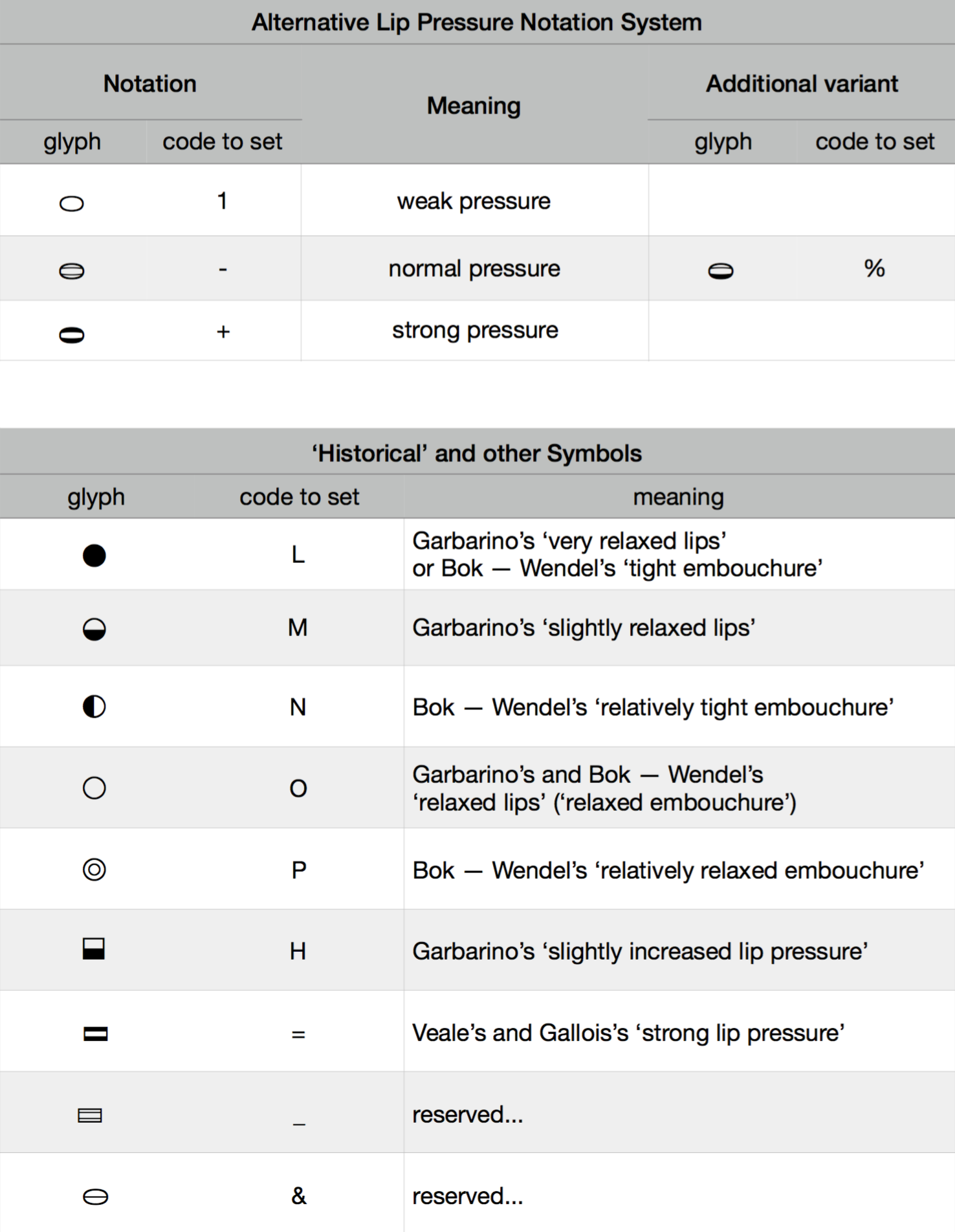
Kh Reed. Pressure. Lips and Air:
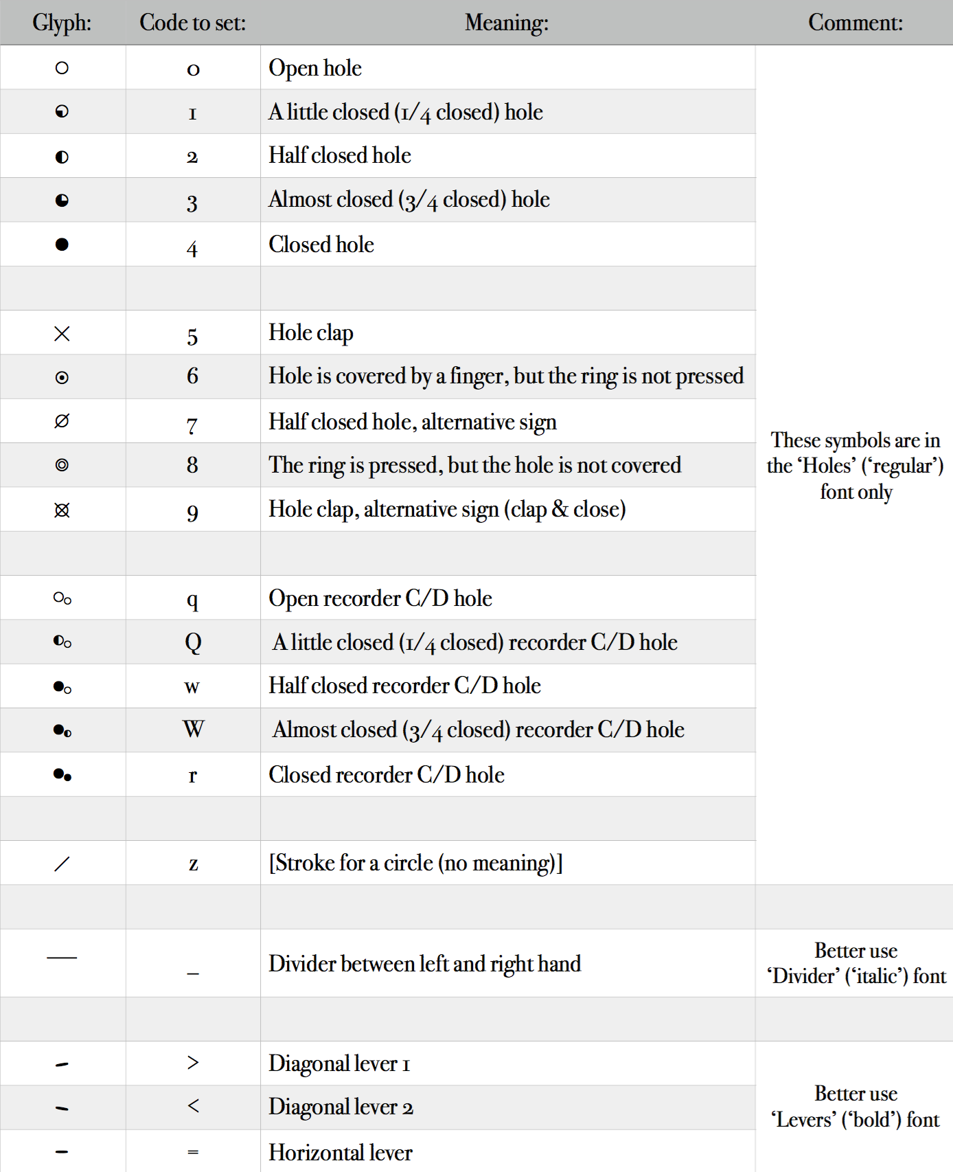
Kh Woodwind Fingering Chart:
Font list
Kh
- Kh Accidentals
- Regular
- In_Parentheses (Bold switch)
- Kh Noteheads
- Basic (under construction)
- Stroke 1 (in project) — 4 switches
- Stroke 2 (in project) — 4 switches
- Cross (in project) — 4 switches
- Circle (in project) — 4 switches
- Circle Stroke 1 (in project) — 4 switches
- Circle Stroke 2 (in project) — 4 switches
- Circle Cross (in project) — 4 switches
- Kh Woodwind Fingering
- Chart
- Holes (Regular switch)
- Divider (Italic switch)
- Levers (Bold switch)
- Flute (in project)
- Oboe (in project)
- Clarinet (in project)
- Bassoon (in project)
- Saxophone (in project)
- Chart
- Kh Reed.
- Pressure. Lips and Air
- Position
- Regular
- Tongue (Bold switch)
Download Kh
designed by Nikolay Khrust